Tempo Labs

About Tempo Labs
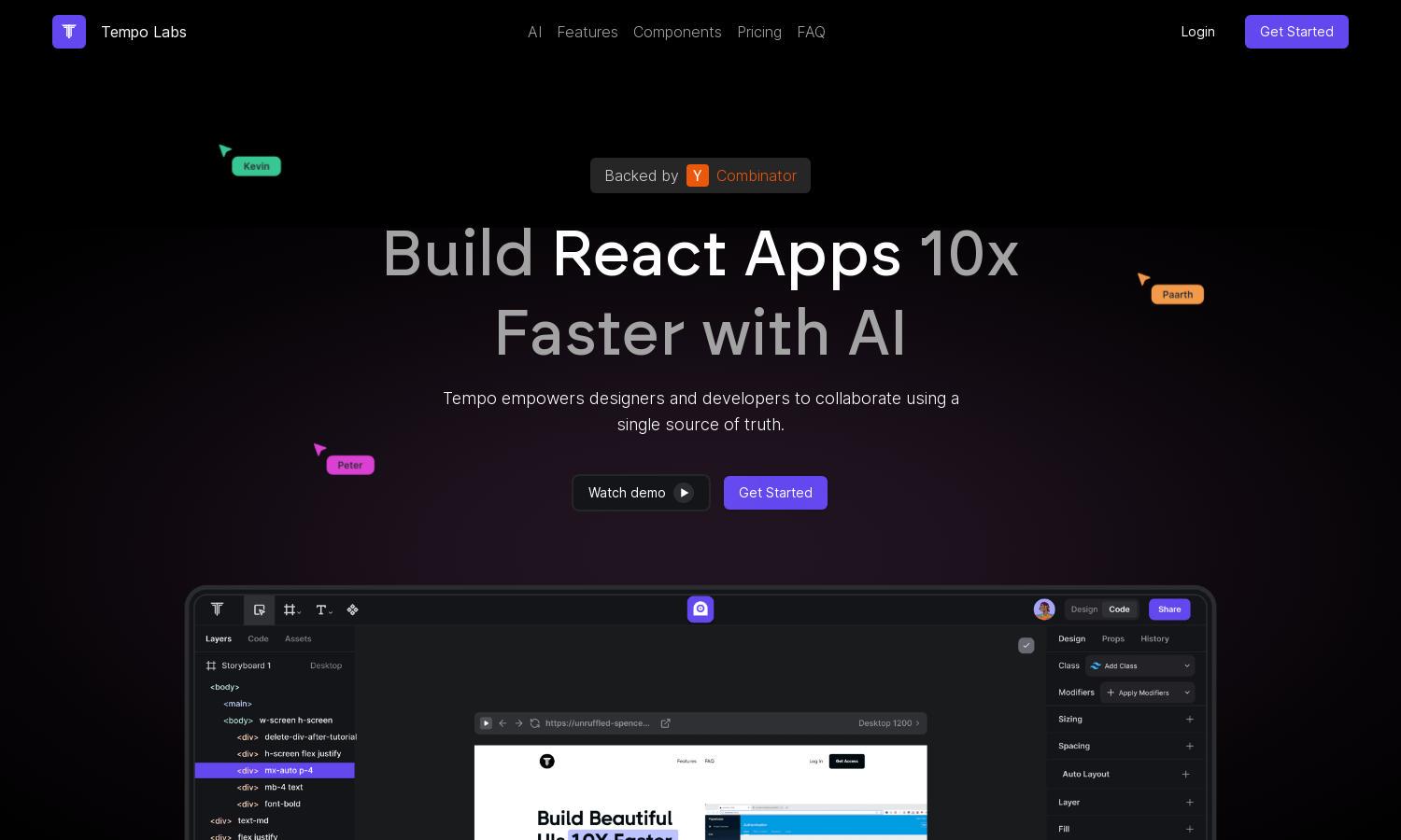
Tempo Labs empowers designers and developers to create React applications efficiently using AI technologies. By offering a single source of truth, it streamlines collaboration and design processes. Its innovative feature allows users to generate UI from text and image prompts, solving the complexity of design and code integration.
Tempo Labs offers three pricing plans: Free ($0/month) includes 50 slow GPT-4 uses, Pro ($20/month) provides 500 fast GPT-4 uses, and Agent+ ($4,000/month) delivers human-designed features weekly. Upgrading enhances productivity and access to premium features, helping users maximize their app development potential effectively.
The user interface of Tempo Labs is designed for simplicity and efficiency. With a drag-and-drop editor and visual code editing, users find it intuitive to navigate between design and code management. Tempo Labs offers a smooth browsing experience, making React app creation easy for teams.
How Tempo Labs works
Users start with Tempo Labs by signing up and onboarding their existing React codebase. The platform allows seamless generation of UI components through AI prompts, enabling quick customization. With an easy-to-navigate visual editor, users can manage layouts, styles, and collaborate efficiently, enhancing development speed and teamwork.
Key Features for Tempo Labs
AI UI Generation
Tempo Labs features AI UI Generation, which allows users to create React components from simple text and image prompts. This innovation accelerates the design process, enabling teams to bring ideas to life quickly and efficiently, thereby dramatically streamlining app development.
Visual Editing Interface
The Visual Editing Interface of Tempo Labs enables users to edit React code visually, making the development process intuitive. This feature empowers designers and developers to collaborate effortlessly while fine-tuning design elements, simplifying the transition between visual design and functional code.
Component Library Integration
Tempo Labs provides Component Library Integration, allowing users to import existing components from Storybook or generate custom libraries swiftly. This feature not only saves time but also enhances the reusability of design elements, making the development process more efficient and organized.
You may also like:


